Advanced Statistics with Acusera 24.7
Advanced Statistics with Acusera 24.7
The only thing that sounds more terrifying than statistics, is advanced statistics. For many of us, the dread associated with having to carry out complex calculations can be too much to bear. For others, statistics are not just a set of numbers; they’re a captivating puzzle waiting to be solved. The allure of dissecting intricate patterns, unravelling hidden relationships, and drawing meaningful conclusions makes these statistical enthusiasts embrace the challenges of advanced statistics with excitement rather than apprehension.
No matter which camp you’re in, we bet you’re going to love the advanced statistics features included in Acusera 24.7. From Uncertainty of Measurement to Sigma Metrics, we’ve got you covered. Let’s explore these features and how we can make your statistical analysis easier than ever before.
Measurement Uncertainty
If you’re involved in laboratory quality control, you’ll have heard all about measurement uncertainty (MU). To some it’s intuitive. To some it’s a labyrinth. MU is defined as a parameter associated with the result of a measurement that characterises the dispersion of values that could reasonably be attributed to the measured quantity. For example, if we say the pencil below measures 16cm ± 1cm, at the 95% confidence level we are really saying that we are 95% sure that the pencil measures between 15cm and 17cm.

In other words, the calculation of MU gives medical laboratories an estimate of the overall variability in the values they report. This is important for 3 reasons:
- It helps ensure the measured results are useful and not wildly inaccurate.
- It permits meaningful comparison of medical decision limits and previous results of the same kind in the same individual.
- It’s a regulatory requirement – ISO 15189:2022
All measurements involve some degree of inherent variability due to factors such as instrument limitations, environmental conditions, and biological variation. MU aims to quantify the doubt or range of possible values around the measurement result, helping to provide an understanding of the reliability and limitations of measurements. To complete this task comprehensively, the entire measurement process must be examined and should consider components such as systematic errors, random errors and uncertainties related to calibration, equipment, and the environment.
ISO 15189:2022 states:

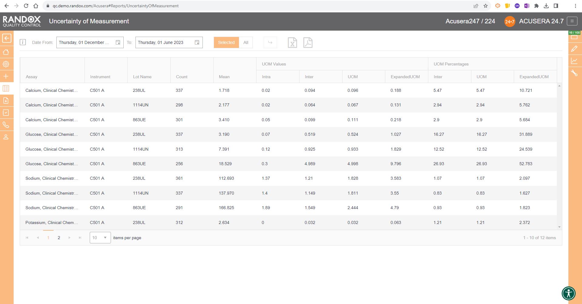
So, if you are seeking ISO15189 accreditation, there’s no avoiding MU and advanced statistics. Lucky for you, Acusera 24.7 can calculate MU and provide you with a report which you can export to Excel or PDF for auditing or archiving.
By liberating you from the need to manually calculate MU for all your assays and control levels, Acusera 24.7 streamlines the statistical analysis process, freeing you up to complete your other essential duties. It also helps reduce the chance of errors in the calculation; after all, no matter how talented you are at mathematics, we all make mistakes. The real-time nature of this kind of monitoring means you don’t have to recalculate every time you get more data – simply press the refresh button and you’ll automatically get a new MU report.
By incorporating automated tools to calculate MU, you gain the ability to proactively pinpoint and rectify potential error sources, mitigating the risk of inaccurate measurements and the repercussions that may follow.

For more information on MU and how it’s calculated, see our education guide – How to Measure Uncertainty.
Sigma Metrics
The Sigma model was originally developed for the manufacturing industry as a method of process improvement focusing on minimising errors in process outputs. It has since been adopted by the medical laboratory to improve result reporting.
This model calculates the number of standard deviations or ‘Sigmas’ that fit within the quality specifications of the process – as the sources of error or variation are removed, the standard deviation becomes smaller, and the sigma score increases – 6 being the target. A 6 Sigma process can be expected to produce 3.4 defects, or false results, per million.

Using your predetermined performance limits, including biological variation (standard), RiliBÄK and CLIA, as the total allowable error (TEa), Acusera 24.7 can calculate a Sigma Score for a particular assay, method, or instrument, saving you the hassle of calculating this manually – freeing you up to investigate the sources of error and make improvements to your process.
This is displayed in our Statistical Metrics report along with Count, Bias%, and CV for your chosen range, your cumulative results and those from other Acusera 24.7 users from around the world to provide straightforward and comprehensive statistical analysis and peer group comparison.

Once you’ve found out your Sigma Score for an assay, you can use this to determine your QC frequency and the multi-rules you should apply to your QC. The higher your Sigma Score, the less multi-rules you need to apply to your analysis and the less often you need to run QC for that assay. The table below shows the multi-rules and QC frequencies associated with each Sigma Score.

Acusera 24.7 includes multi-rule capabilities that can be utilised to monitor your QC data and index it as accepted, rejected, or trigger an alert, depending on the pre-defined multi-rules against which you want to check your data. These features enable the identification of nonconformities and reduce the need for laborious manual statistical analysis while enhancing the accuracy and precision of the laboratory. To read more about the multi-rule features of Acusera 24.7, take a look at our educational guide – Understanding QC Multi-rules.

Now that we’ve found which of our assays are underperforming, we can begin to take corrective action. The Sigma Score is affected by bias and imprecision of laboratory results, therefore improving these values will increase the Sigma Score. Some of the steps a laboratory can take are:
- Improved staff training
- Instrument maintenance
- Frequent calibration
- Strict adherence to SOPs when preparing controls and calibrators.
If you are still in the dark ages, carrying out your statistical calculations and analysis manually, reach out to us today to learn more about the time and expense we can help you save. Every day, more people are discovering the power of Acusera 24.7 and the benefits it has in their laboratory.
The updates to ISO151589:2022 are based around increasing patient safety and reducing erroneous results, making advanced statistics essential. Assessors get excited when they see Acusera 24.7 in the lab because they know quitting time is that bit closer. Allow us to help you achieve your accreditation and provide the best possible patient care. With complete onboarding assistance and first-class customer support, you’ll always be ready to get to the bottom of any problems you might face. Get in touch today at marketing@randox.com
Effortless Data Management: Acusera 24.7 Reports
You’ve carried out your daily maintenance and run your IQC. You’ve got your results and now it’s time to type them up into one of your expansive spreadsheets. Reports
You’ve probably got your spreadsheet set up to calculate the required parameters already, but what if there’s an error in the formula? Or what if you make an error when entering your data? Or worse, what if you try to open the spreadsheet only to find that the file is corrupted or lost? If your Excel file is there, someone else might already be editing it, meaning you must wait until they’re finished before you can make any changes.
Even if you face none of these obstacles the labour-intensive statistics needed for performance review and validation might just keep you up at night.
Well, with Acusera 24.7, these concerns are history.
Whether you make use of our automated or semi-automated data entry options, you can be sure that the data put into the system is exactly that returned by your instrument. If you use the manual data entry option, we can’t remove the human error element – but with our simple and intuitive interface, we trust you’ll be flawless anyway. What’s more, the cloud-based nature of our software also means you won’t lose the data by mistake and unique access for each user allows multiple people to be logged in at the same time.

So, what next?
Well, you can view this data on our dashboard for fast and easy access to your results but delve a little deeper into Acusera 24.7 and you can access comprehensive, easy-to-read, customisable, reports designed to speed up the review process.
These reports include statistical analysis, exception reports, peer group statistics, uncertainty of measurement and advanced statistical metrics. The latter two we’ll look at in a dedicated article. For the others, however, let’s dive in and see how you could benefit from our range of extensive reports.
Statistical Analysis Reports
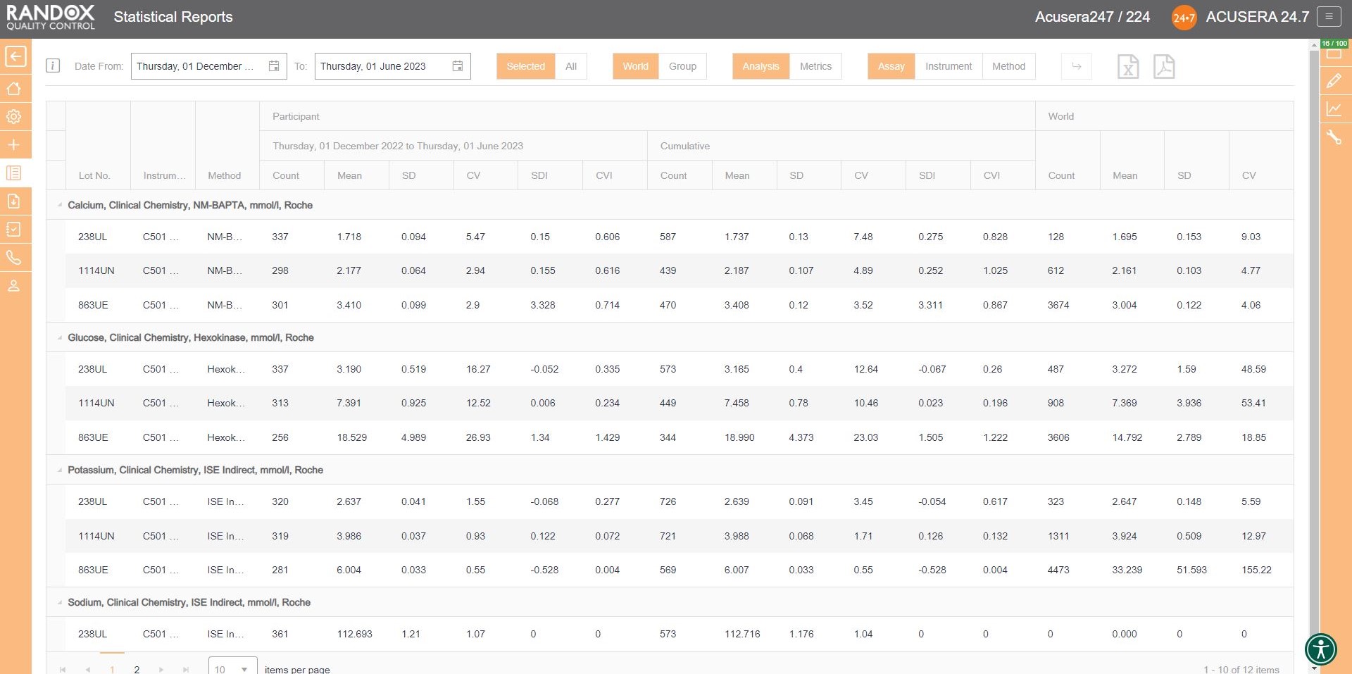
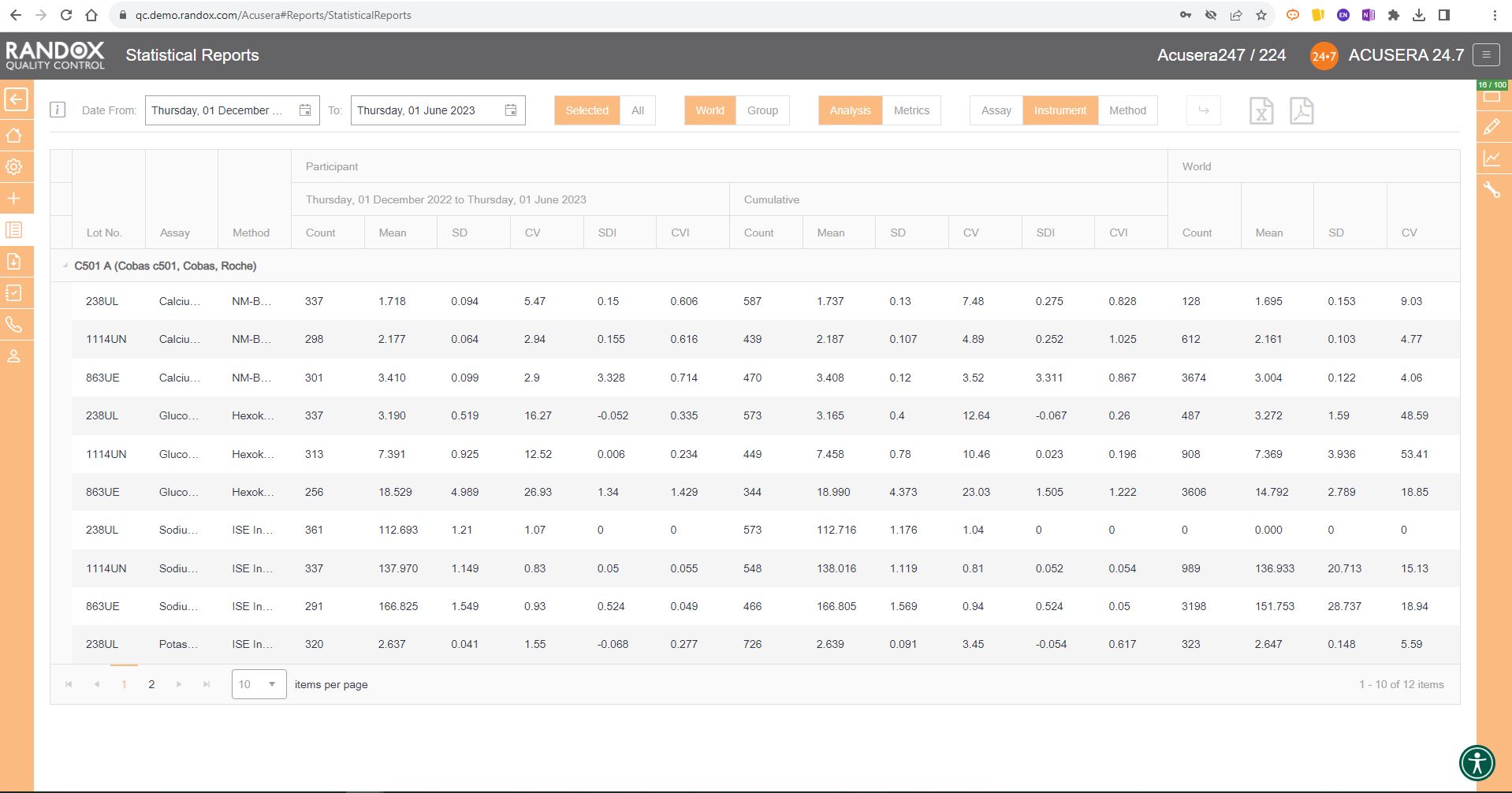
The first report we will look at is the statistical analysis report. This report allows you to view your IQC data from a specified date range, and compare it to your cumulative data, that is, all the IQC data you’ve collected since you began using that lot, as well as the peer group data for the same lot all within one screen. If you are part of a chain of laboratories, you can compare this data with your laboratory group to see how your lab stacks up by using the World/Group toggle button.
This report provides you with the count, mean, SD, CV, SDI and CVI for a lot and can be organised by assay, as shown in the image below, instrument, or method, allowing you full freedom to customise this report to suit your needs. Don’t forget, like all our reports and charts, this data is fully exportable to PDF or Excel for filing or data review.
Handy, right? This report provides you with everything you need to carry out the validation and verification of new IQC lots, plus much more. We’ll look at this in more detail in an upcoming article.
Exception Reports
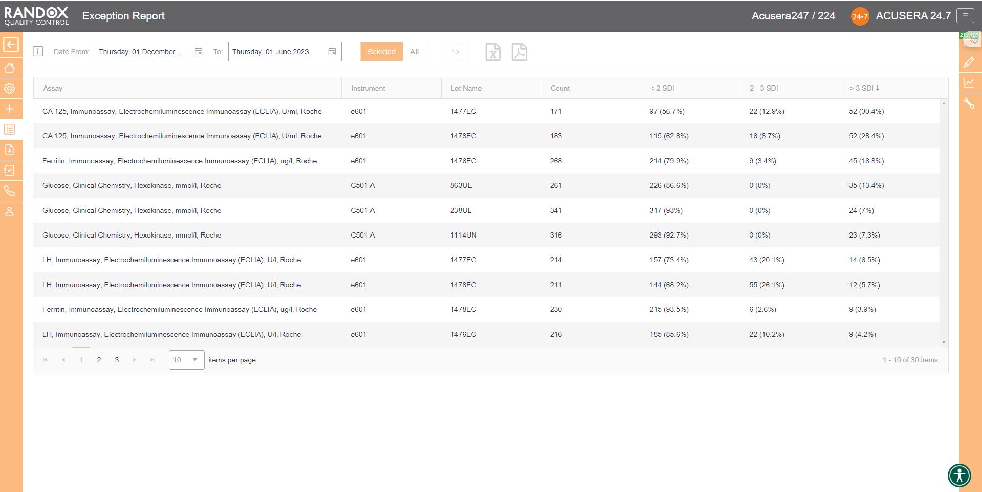
If you wish to determine your best and worst-performing tests, our exception report is perfect for you. This report is designed to quickly and easily identify assays with a high percentage of errors. The exception report provides an on-screen summary of the number of QC results for each individual assay and control lot that fall within the following categories: <2SD, 2-3SD and >3SD. This comprehensive performance review can be filtered: by clicking on the top of the ‘>3DSI’ column, this report will display assays in descending order with your worst-performing assays at the top, as shown below.
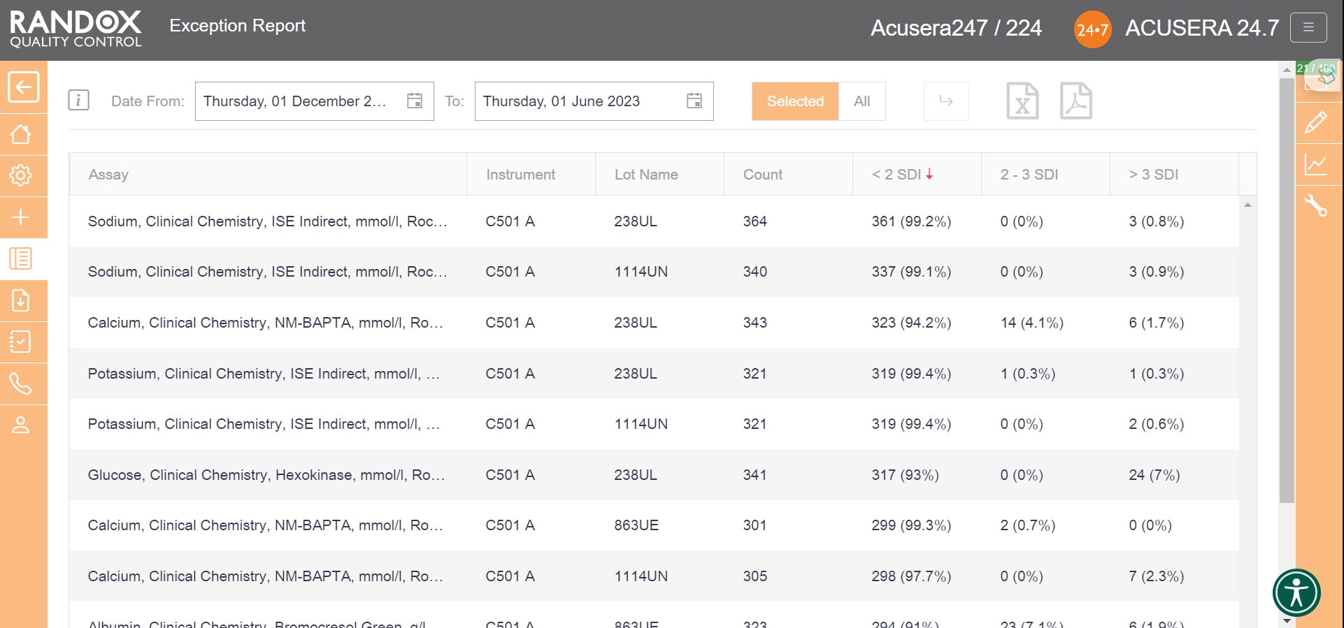
Filtering by ‘<2SDI’, it will display the same data with your best-performing assays at the top.
With this information, you can determine in which of your assay’s failures most often occur and encourage staff to look a little more closely at why failures arise and identify changes to improve and minimise errors.
Peer Group Statistics Reports
Now that you have figured out the performance of your assays, you’ll want to see how you compare with others running the same tests. Our Peer Group Statistics Report is your new best friend.
Updated live and in real-time, with no submission deadlines, you can compare your statistics to those of your peer group, determined by analyte, method, instrument manufacturer and model.
Simply select the IQC lot you wish to analyse and Acusera 24.7 will generate the data for you, displaying the count of QC data, mean, SD and CV, giving you comprehensive insight into your performance vs your peers.
You can customise this report even further. If you select an analyte, we’ll show you the data for that analyte alone. If not, we’ll show you the information for all analytes related to that lot. The same goes for specifying a date range – if you choose a range, we’ll show you the data inside that range alone. If not, we’ll show you all the data for your chosen lot.
By clicking on the headers, you can filter the data – 1 click will display the data in ascending order, 2 will show you a list in descending order and 3 clicks will reset the table.

When these reports are combined with the other impressive features of Acusera 24.7, like our fully customisable charts or advanced statistical analysis, this software can help streamline your IQC procedure and data review process.
When the accreditors come knocking, others will be scuffling around trying to gather multitudes of reports and files, but you will be sitting with a smile on your face and your feet up, because you’ve got Acusera 24.7.
With full onboarding assistance and technical support that’s top-of-the-class, you’ll always have someone to help you get to the bottom of any problems that you face.
If you haven’t already booked a demo, get in touch with us today and let us show you how much time we can save you with this innovative and intuitive software. Alternatively, take a look at our Resource Hub for some material on Acusera 24.7 or Acusera IQC.
To streamline your QC Data analysis, get in touch with us at marketing@randox.com.
Charting the Course to Laboratory Excellence
Are you still using spreadsheets for your QC data and Charts?
You’ve been left behind.
But don’t worry!
Your laboratory’s ultimate ally in the quest for precision and excellence has arrived.
Acusera 24.7 is a tool that not only streamlines your QC data but also empowers you with a treasure trove of invaluable charts.
These charts are more than just numbers and lines; they are your secret weapon for troubleshooting, achieving accreditation, and driving continuous process improvement.
Acusera 24.7 doesn’t just offer charts. It offers a symphony of insights at your fingertips. From the precision of interactive Levey-Jennings charts to the competitive edge of performance summary charts for peer group comparison, from the rhythm of weekly mean charts to the clarity of reliable SD histograms – these charts are your compass in the world of quality control.
The best part?
You’re in control.
Tailor these charts to your unique needs, whether you’re dealing with single or multiple analytes, an abundance of QC lots, fixed or variable SDs, or need to pinpoint data within a specific date range.
Join us on a journey through the world of Acusera 24.7’s charts, where data becomes your strategic advantage, and discover why more laboratories are choosing Acusera 24.7 for QC data management every day.
Levey-Jennings Charts
Every laboratorian has seen countless Levey-Jennings charts and for good reason.
These charts are the unsung heroes of quality control in the laboratory.
They offer a visual snapshot of data over time, helping to detect trends, outliers, and systematic errors that might otherwise go unnoticed. Levey-Jennings charts are like the heartbeat monitor of your laboratory, providing real-time insights into the health of your analytical processes.
We’ve taken Levey-Jennings charts to the next level.
Our colourful graphs might look like they belong in a modern art museum, but trust me, they’re more than just eye candy.
Acusera 24.7’s Levey-Jennings charts are like the laboratory’s personal detective, sniffing out anomalies and shifts and making sure your QC data behaves.
Let’s have a look at what you can do with the Acusera 24.7 interactive Levey-Jennings charts.
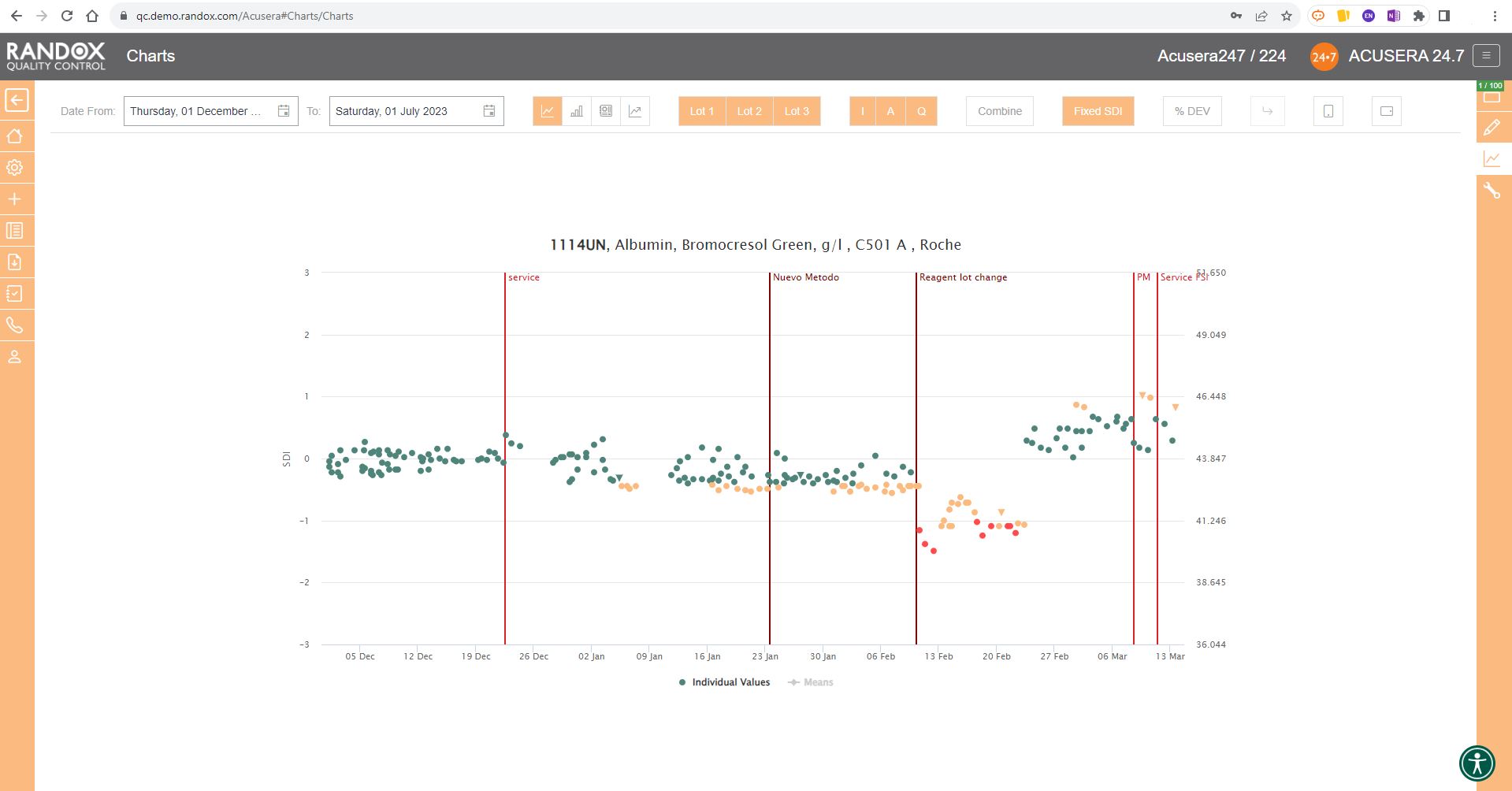
The screenshot below shows a Levey-Jennings chart for a single analyte, with the date on the X-axis and SD on the Y-axis. On this chart, you can see data points displayed in different colours. Green data points indicate an acceptable result. Orange points show data that has triggered your predefined alert criteria, while red points are those that have broken your set rejection rules.
The lines marked on the chart below represent events that have been recorded. Instrument events such as calibration events or maintenance can be recorded to monitor their effects on your QC, allowing you to quickly see how these events relate to any deviations or improvements in your QC data. For example, after the event labelled ‘Reagent lot change’ you can see a series of alerts and failures. Marking this event on the chart allows for an at-a-glance explanation of this deviation. These events are completely customisable so you can record any relevant information you want!
Finally, data points that appear as a triangle indicate a comment has been added. What text is included in the comment is completely up to you!
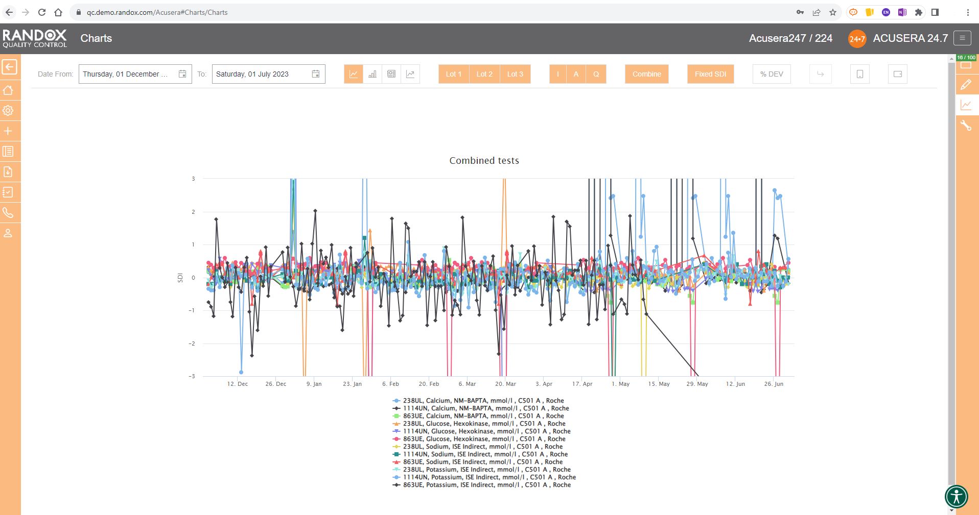
The next screenshot below shows a Levey-Jennings chart containing QC data for all the tests included in the Clinical Chemistry Panel.
Acusera 24.7 panels allow you to group related tests together, helping increase the efficiency of your data review.
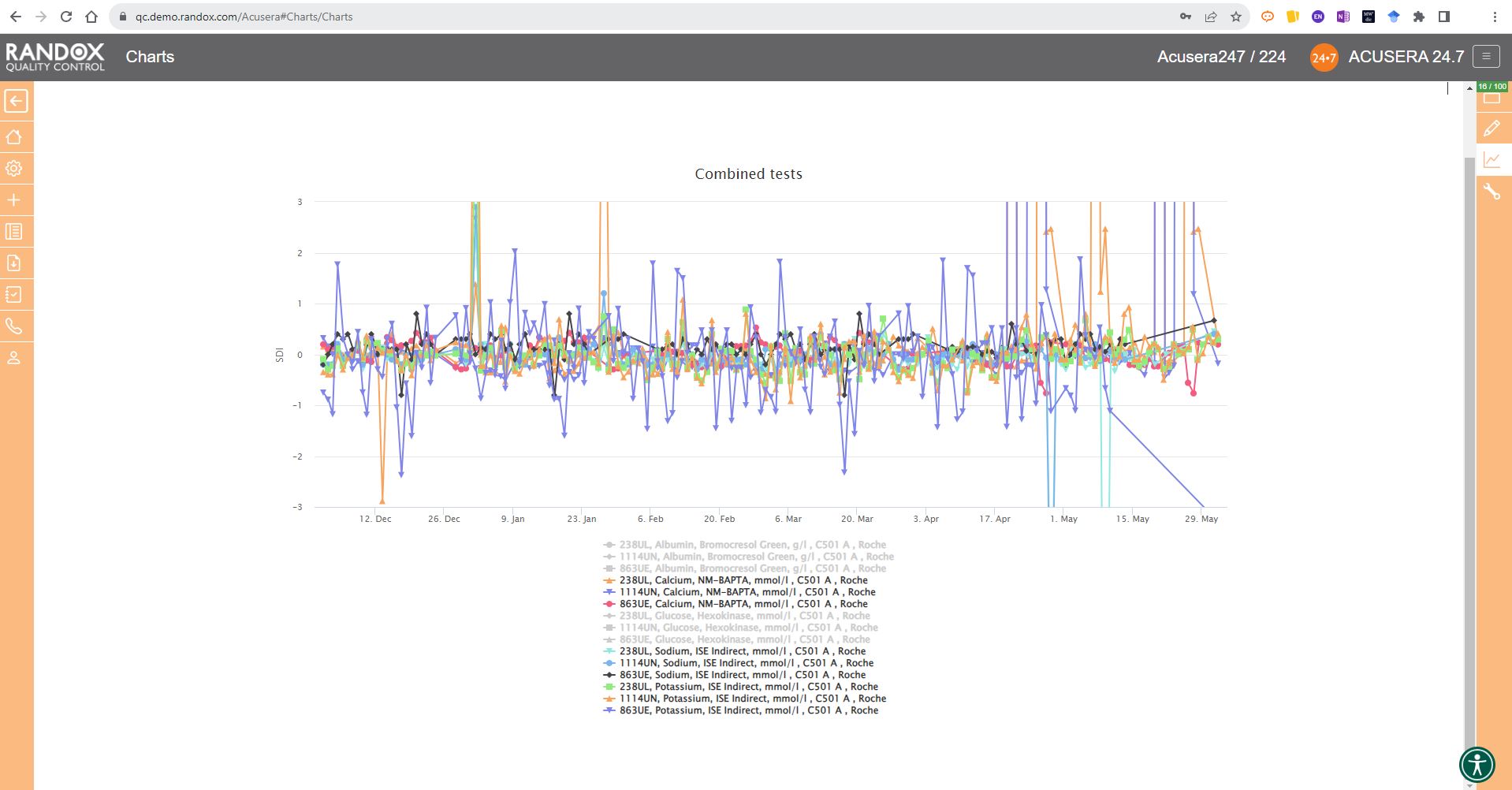
It looks great, right?
Maybe a little confusing.
The screenshot is perhaps a little deceptive.
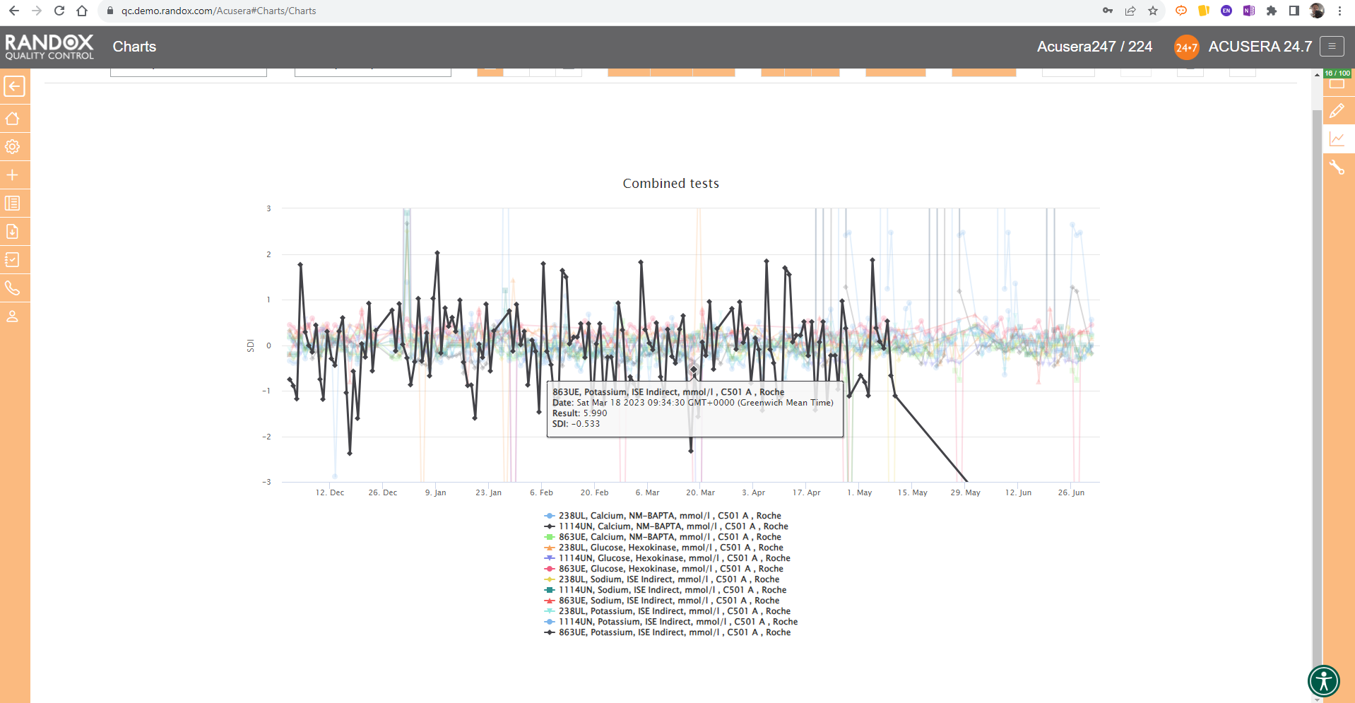
When viewing these charts live, you can view the data as a whole, or home in on individual data sets by simply hovering over the data you want to see. You can also selected a deselect datasets at will by clicking on its name in the list below the chart.
The screenshot below shows an example of this.
All the charts we’ve looked at so far have had a fixed 3SD on the Y-axis.
For a more in-depth review of your data, you may wish to expand this axis.
With the click of a button, you can expand the Y-axis to include all your data points. See below for an example.

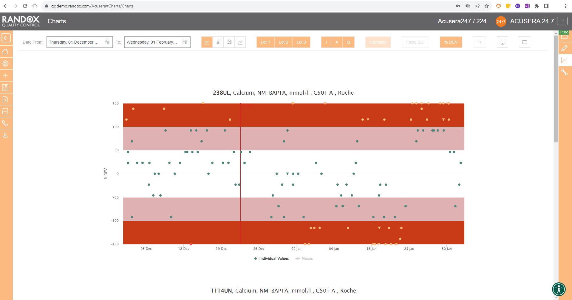
In some cases, you may wish to view this data displayed as ‘% Deviation’.
Again, with the click of a single button, you can convert the Y-axis to show just that, as shown below.
Performance Summary Charts
Peer group comparison of IQC data has a lot of benefits.
Comparing your data with other laboratories that use the same QC lot, instrument, method and more, can help you with troubleshooting and continuous process improvement.
The Acusera 24.7 Performance Summary Charts do all the work for you.
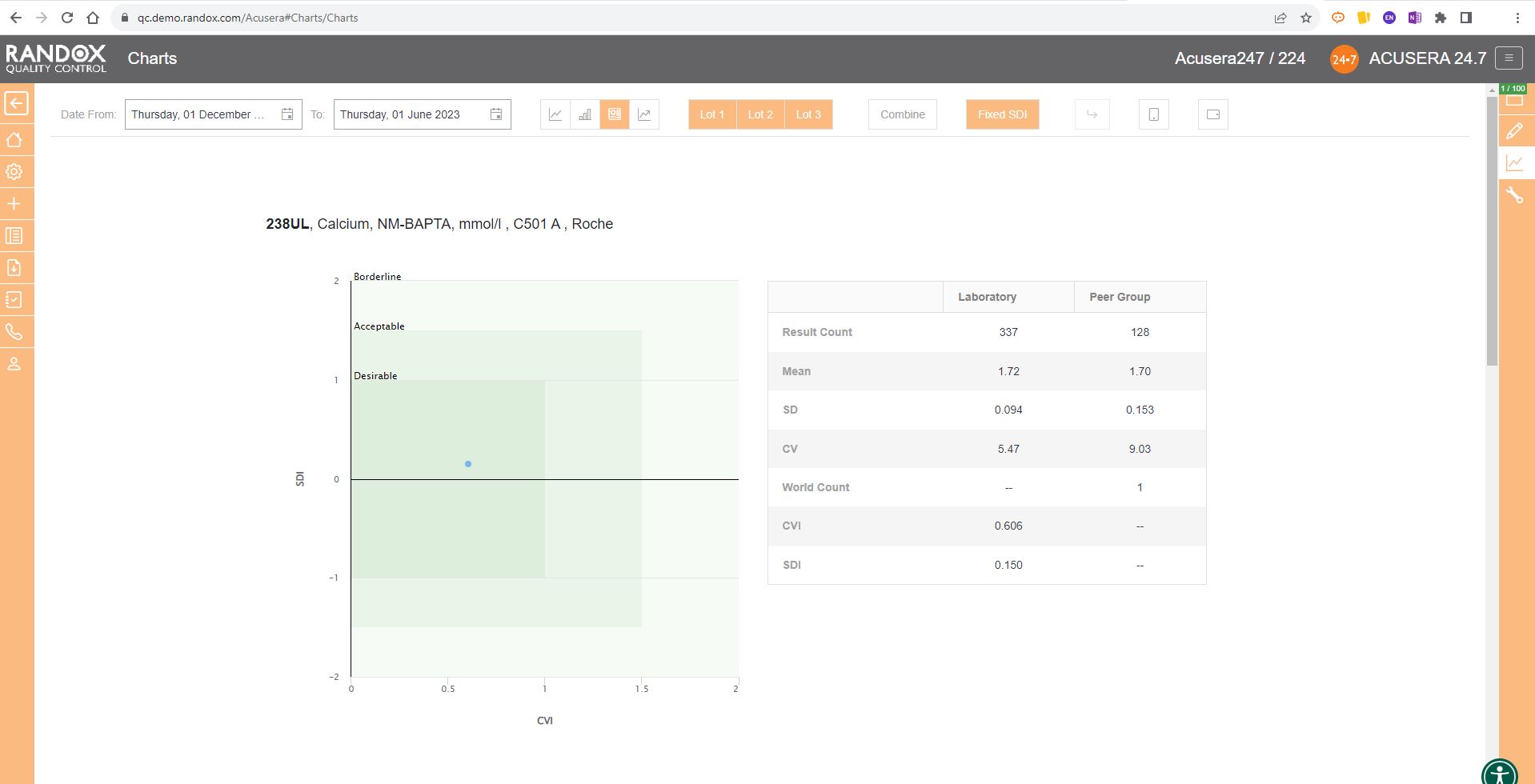
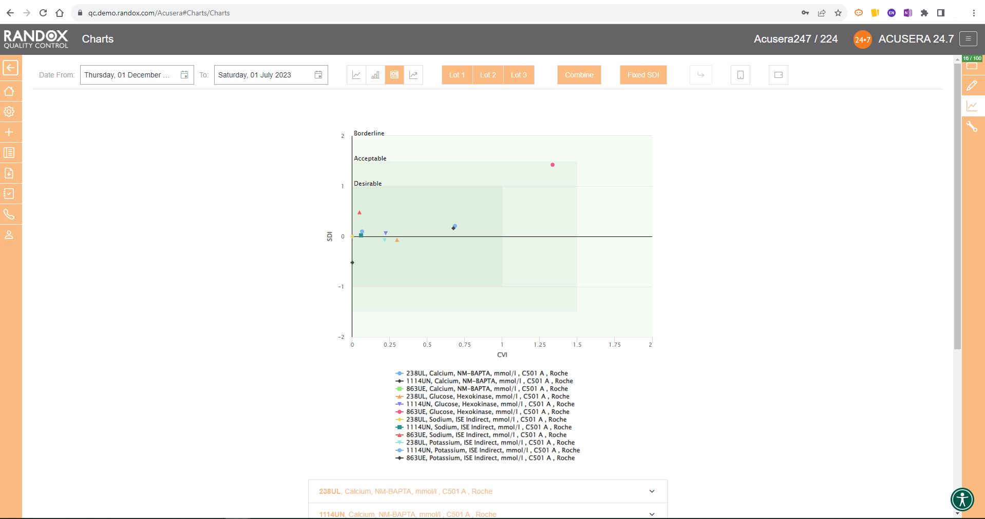
As shown in the screenshot below, these charts display your data and how it compares to your peers including mean, CV, and SD.
You can also view this data in a table to get a more detailed picture of your performance.
Like the Levey-Jennings charts, you can also combine this information for panels or a selection of multiple lots and analytes. You can see an example below:
Weekly Mean Charts
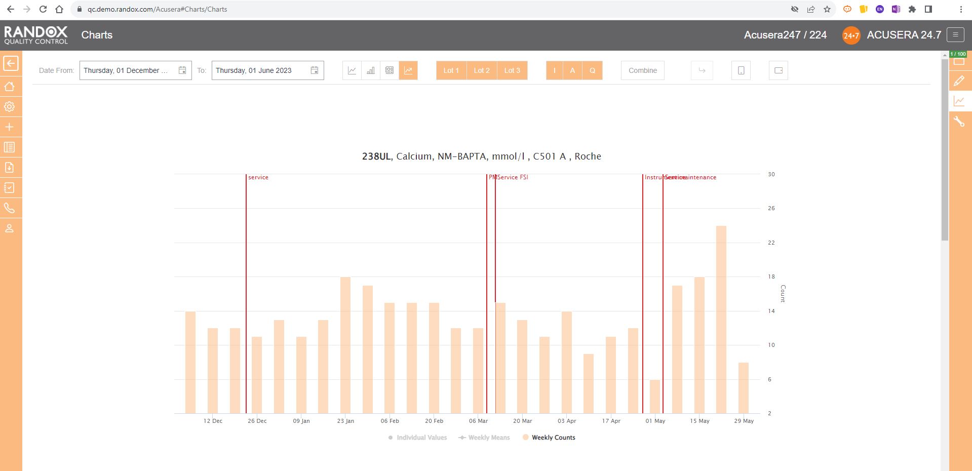
Weekly Mean Charts are one of the new features in our latest software release.
They allow you to view your weekly count of QC results for a specific instrument, assay, or lot.
Below is an example in a bar chart format.
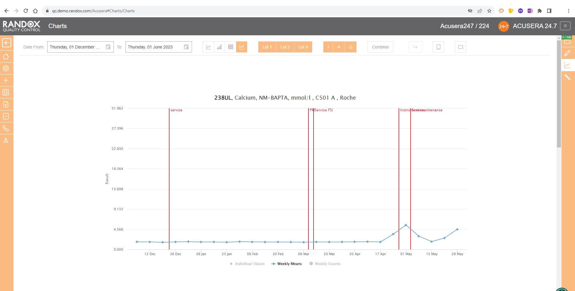
You can also view this data as a line graph, which plots the weekly mean of results from multiple instruments using the same assay and QC lot, allowing a comprehensive overview of your QC data.
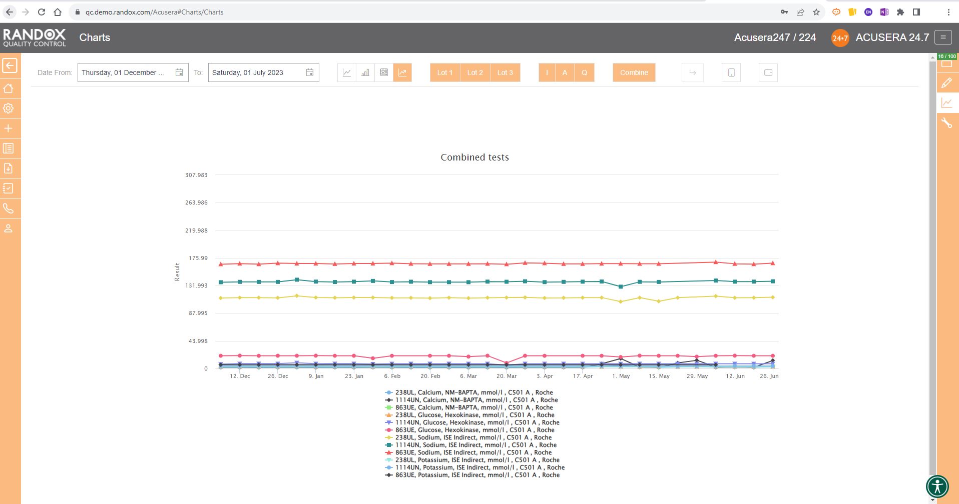
Or you can view your weekly means for a range of tests and panels.
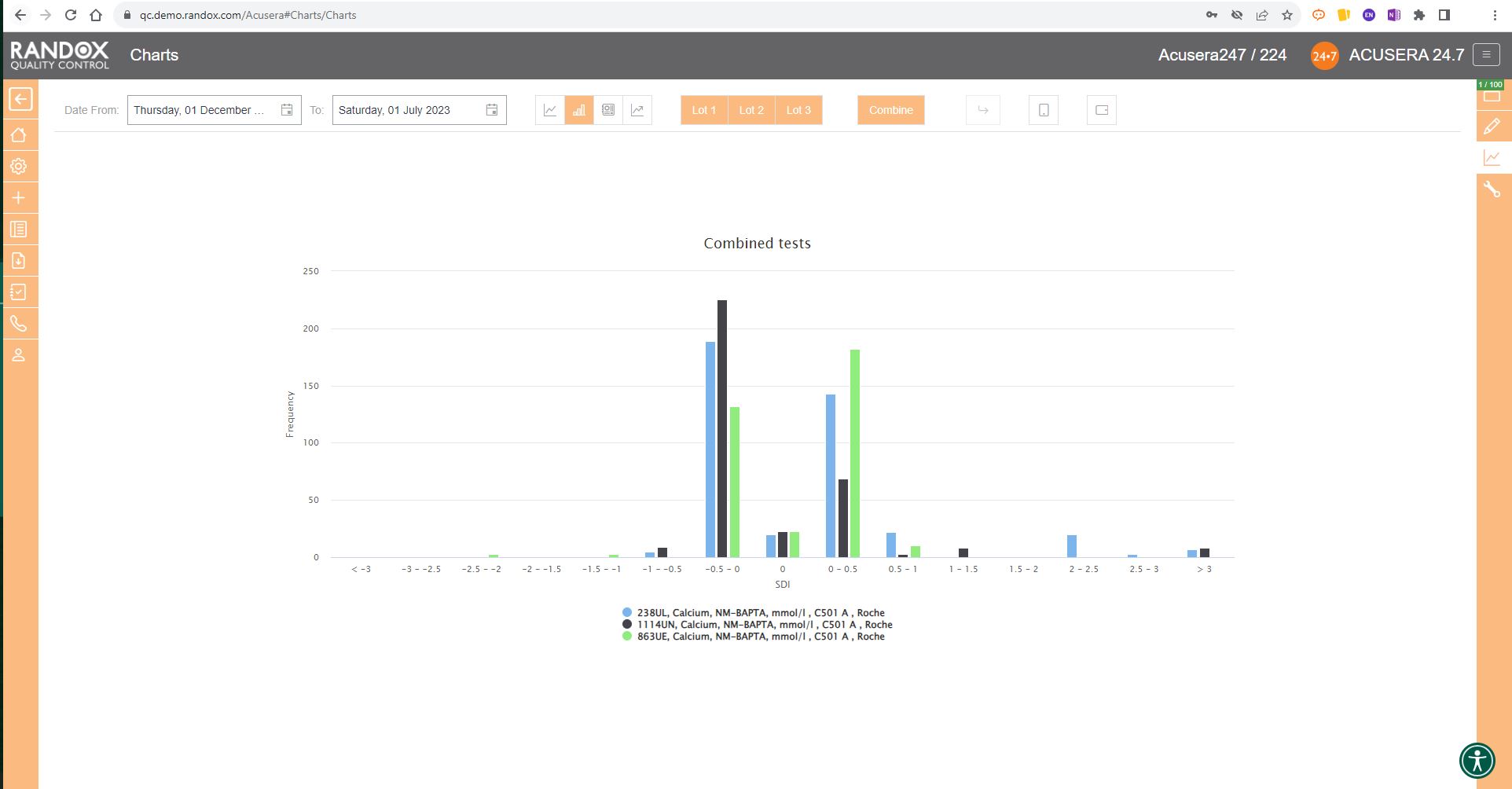
Finally, the SD Histograms allow you to view the distribution of your results, for an overview of performance.
When used with Acusera 24.7’s suite of advanced statistical tools and reports, our charts can help you reduce the time you spend investigating non-conformances.
When the dreaded accreditation assessment approaches, you can relax. While others are scrambling to find documentation, you can rest assured that all the QC data you need is easily accessible.
Assessors love to see Acusera 24.7 load when they enter a laboratory because they understand how much easier QC management is when using our software.
We provide complete onboarding assistance and full training on the software for new customers while delivering prompt and effective customer support for existing users. The Acusera 24.7 and QC operations teams are always eager to help new and existing Acusera 24.7 users with any issues they experience.
To learn more about the features of this ground-breaking software, visit our website here.
Alternatively, feel free to reach out to us at marketing@randox.com for more information or to arrange a demo!
From Fear to Freedom: A QC Data Management Revolution
What if we told you we had a solution to the multitude of monotonous hours spent analysing reams of IQC data and could provide you with an intuitive tool packed with comprehensive and customisable reports, interactive charts, and automated statistical analysis to help improve your QC data management?
Perhaps it sounds too good to be true?
This time, it isn’t.
Uncertainty of Measurement. 6Sigma. QC Multi-rules. These words can strike fear into the hearts of even the most experienced laboratory staff.
With Acusera 24.7, we’ve reached under the bed and forced the monster that is advanced statistical analysis out into the cold.
Acusera 24.7 is a live, cloud-based, interlaboratory QC data management and peer group comparison software.
A mouthful. I know.
But let’s break it down
A live, cloud-based software means you can access your QC data from anywhere, anytime.
Bid farewell to the labyrinth of folders you hunt through when troubleshooting or looking for a specific dataset.
Interlaboratory management describes the momentous task many QC managers face – monitoring the QC performance of multiple laboratories in different locations, ensuring they all maintain the high standards required for accreditation and accurate patient results.
Unlike some big-name subscription services, we encourage you to use our software at different locations to help you monitor all your laboratories and instruments to see how their results stack up against one another.
Acusera 24.7 provides multiple levels of access which are completely customisable. This allows you to grant or restrict access to different parts of the software depending on what is required by your staff. This also allows QC managers to view data from all their sites in one location without needing multiple email chains from each laboratory.
Peer group comparison? Isn’t that what EQA is for?
Well, you would be right.
Yes, EQA does provide a comparison with your peer group, but it doesn’t have exclusive rights.
There are many benefits to comparing your IQC data with your peer group. The real-time comparison data aids with troubleshooting, or you can show off how great you are to your friends and colleagues.
You can select your peer group for an instrument, method and more, providing you with a comprehensive picture of how your laboratory performance compares to your peers using the same lot of control.
There are no submission deadlines. One less thing for you to worry about.
Still think it sounds too good to be true?
Then let’s look at some of the software features and how they can be used to make your daily QC data management easier.
Charts
For many laboratories, review of their QC data is a momentous task involving an abundance of printouts with different data tables and graphs and hastily scribbled notes going back maybe months, if not years.
With Acusera 24.7’s interactive Levey-Jennings charts, you can see the QC data from a specified date range. This helps visualise trends and biases over any period to simplify the troubleshooting and lot validation processes, or, can be used as evidence during accreditation assessments. These charts can be generated for a single analyte or for multiple analytes and QC levels.
You can also add events to the graph to record factors that might impact the performance of your analyser such as preventive maintenance, calibrations or switching QC lots. So, when you come to review the QC data and see a shift in the results, you can see at a glance if there was an explanation for the change in QC results.
What’s more, the points plotted on the chart will appear in orange or red if they trigger your alert or reject protocols respectively. Those that appear as a triangle indicate a comment is attached. Comments can be added to any data point directly on the Levey-Jennings chart, allowing you to record any information relevant to the data, saving you time, not to mention the cost of all those sticky notes.

This complements the Panel feature of the software. Within Acusera 24.7 you can create a panel of tests, for example, a Liver Function Test panel, grouping all the tests together. You can then view all the QC data for this panel at the click of a few buttons. Shown below is the collective data for a clinical chemistry panel.
When you do need the paper copy, all the charts and reports found in Acusera 24.7 can be exported to Excel or PDF for independent analysis or printing, making it easy to bring your data to meetings or for hardcopy filing and audits.
For peer group comparison, you can get a performance summary chart. This chart basically does the analysis for you! You define the date and time range, and the software looks at all the data points within it for you and your peer group, comparing individual data, means, CVs and SDs. Like our other charts, you can combine any number of these for multi-analyte analysis.

Advanced Statistics
Some people love statistics. Others can think of nothing worse.
Either way, there’s a lot of work involved in advanced statistical analysis.
Even if you’re in the love camp, you might find yourself sickened before you’ve finished this metaphorical jar of marmite.
The role of a pathology laboratory is not to run QC and show off their statistical skills, but to provide accurate and appropriate patient results.
As the old saying goes, time is money.
But in your case, time is the difference between a fast or delayed diagnosis for a patient.
This may impact their condition or treatment.
By making use of the suite of statistical options included in Acusera 24.7, including QC Multi-rules, 6Sigma and Uncertainty of Measurement, you can focus on providing the most accurate and efficient testing for patients.
Data Entry
To save even more time, Acusera 24.7 can be integrated with many LIMS or Middleware packages for fully automated data transfer. At a predefined time, your internal software will send your QC data to a shared folder on your network and from there to a Randox Cloud IP address, meaning we don’t go into your IT system and take anything; we won’t cause any information security problems. This data is then taken from the cloud and populated onto 24.7.
All this in less time than it takes you to say, ‘fully automated data transfer.’
You can also import your data through a semi-automated upload procedure. For this, the data is exported from your LIMS or middleware and imported manually to your Acusera 24.7 account using an EDI import file. Simply put, all you have to do is send the file, and the software will populate it onto the system. Alternatively, you can upload the data manually on the simple and intuitive data entry page.
Acusera 24.7, while comprehensive and initially daunting due to its vast array of features, is incredibly easy to use. The Acusera 24.7 and QC operations teams are always eager to help new and existing Acusera 24.7 users with any issues they experience. We provide complete onboarding assistance and full training on the software for new customers while delivering prompt and effective customer support for existing users.
We’ve only begun to cover the range of features available on Acusera 24.7 for QC data management! For more information or to arrange a demo, get in touch with our team at marketing@randox.com. Or, you can take a look at our website here.


